
Content
In a previous tutorial, I showed you how to extract HTML tables with Pandas using just a few lines of code. In this article, I'll show you how to plot a Pandas DataFrame with Matplotlib to visualize that data.
What is data visualization in Python?
Data visualization is all about clarity, precision, and efficiency in the presentation of information. Its purpose is to communicate data clearly so users can identify patterns, trends, relationships, and insights that may not be apparent from raw data alone.
Data visualization in Python means generating charts, plots, and other graphical representations of data with tools such as Matplotlib, Seaborn, and Plotly (to name just three) to communicate findings effectively.
Python data visualization libraries
Python provides several powerful libraries for data visualization so you can create a wide range of charts, graphs, and plots.
Matplotlib and Pandas, which we'll use in the tutorial below, are two of the most popular libraries for data visualization in Python.
However, there are several others to consider as well.
1. Matplotlib
Matplotlib is a versatile plotting library that allows you to create a wide range of plots - static, interactive, or animated. It provides a MATLAB-like interface for creating plots, which makes it easy to get started with basic visualizations. Matplotlib is highly customizable, so you can control every aspect of your plots.
2. Pandas
Pandas is a powerful data manipulation library with basic plotting functionality. It provides high-level abstractions for working with structured data, which makes it easy to create plots directly from DataFrames. Pandas' plotting capabilities are built on top of Matplotlib, so you can create simple visualizations with just a few lines of code.
3. Seaborn
Seaborn is built on top of Matplotlib and provides a high-level interface for generating statistical graphics and simplifies the process of creating complex visualizations such as categorical plots, violin plots, and pair plots.
4. Plotly
Plotly is a versatile library that supports interactive and web-based visualizations. It provides numerous chart types, such as scatter plots, line plots, bar charts, and 3D plots. Plotly's interactive features let you zoom, pan, and hover over data points for detailed insights.
5. Bokeh
Bokeh is designed to create interactive and web-ready plots in Python. It supports various output formats, including HTML, standalone web applications, and server-hosted applications. Bokeh's high-level API makes it easy to create interactive visualizations with minimal code.
6. Altair
Altair is a declarative statistical visualization library that simplifies the process of creating complex visualizations. It’s built on top of Vega and Vega-Lite, which are declarative grammar-based visualization languages. Altair's intuitive API enables you to create interactive and publication-quality visualizations quickly.
7. ggplot
ggplot is a Python implementation of the popular ggplot2 library in R. With its grammar of graphics approach, it lets you create complex visualizations by combining simple components. ggplot's syntax is concise and expressive, which makes it easy to create professional-quality plots.
How to do data visualization in Python
In a previous article, I showed you how to scrape HTML tables from Yahoo Finance with Pandas using the pd.read_htmlfunction:
import pandas as pd

yahoo = pd.read_html ("https://finance.yahoo.com/most-active/")

yahoo
In this tutorial, I'll show you how to plot a Pandas DataFrame with Matplotlib to transform that data into three types of graphs.
While these plots and charts may not look that pretty, it’s worth remembering these words of Edward R. Tufte from his book Envisioning Information:
Cosmetic decoration, which frequently distorts the data, will never salvage an underlying lack of content.
1. Prerequisites and setup
Before we begin, make sure you have everything set up to follow along.
- Python installation: If you don't already have it installed on your system, you can download and install Python from the official website.
- Library installation: Install Pandas and Matplotlib by running the following command in your terminal:
pip install pandas matplotlib
- Open Jupyter Notebook: I'll use a Jupyter Notebook file (.ipynb) in Visual Studio Code. To create a new Jupyter Notebook file, open your terminal or command prompt and run the command
touch visualization.ipynb. Alternatively, you can use Jupyter Notebook directly or any other code editor.
With your environment set up, you can run the code I'll show you.
2. Import libraries
Begin by importing the necessary libraries: Pandas and Matlotlib.
import pandas as pd
import matplotlib.pyplot as plt
3. Create a DataFrame
I'll now create a sample DataFrame named 'yahoo' with two columns: 'Symbol' and 'Volume'.
# Assuming you already have yahoo DataFrame loaded
# yahoo = pd.read_html("https://finance.yahoo.com/most-active/")

data = {
    'Symbol': ['AAPL', 'MSFT', 'GOOGL', 'AMZN', 'FB'],
    'Volume': [20000000, 18000000, 15000000, 22000000, 16000000]
}
yahoo = pd.DataFrame(data)
data: This is a Python dictionary that contains the data we want to include in the DataFrame. It consists of two keys: 'Symbol' and 'Volume'.'Symbol': ['AAPL', 'MSFT', 'GOOGL', 'AMZN', 'FB']: This is a list of stock symbols. Each symbol is represented as a string.'Volume': [20000000, 18000000, 15000000, 22000000, 16000000]: This is a list of corresponding volumes for each stock symbol. Each volume is represented as an integer.pd.DataFrame(data): This line creates a DataFrame object using thepd.DataFrame()constructor provided by Pandas. It takes thedatadictionary as input.yahoo: This is the variable name assigned to the DataFrame object. You can choose any valid variable name. In this case, I've named it 'yahoo'.
As noted in my article on scraping HTML tables with Python, if you get an SSL Certificate Verification Error when using the pd.read_html function, you can solve it by importing SSL and adding the following code:
import ssl

ssl._create_default_https_context = ssl._create_unverified_context
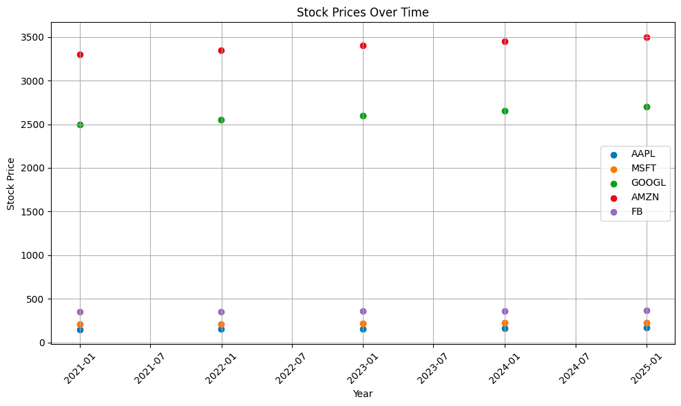
4. Creating a scatter plot
In this example, I'll create a scatter plot to visualize the volume of the most active stocks.
plt.figure(figsize=(10, 6))
for stock in ['AAPL', 'MSFT', 'GOOGL', 'AMZN', 'FB']:
    plt.scatter(yahoo['Date'], yahoo[stock], label=stock)

plt.title('Stock Prices Over Time')
plt.xlabel('Year')
plt.ylabel('Stock Price')
plt.xticks(rotation=45)
plt.grid(True)
plt.legend()
plt.tight_layout()
plt.show()
- With Matplotlib, I created a scatter plot using
plt.scatter()for each stock. The x-axis represents the years, and the y-axis represents the stock prices. - I customized the chart title, x-label, y-label, and other properties to enhance readability.
- Finally, I used
plt.show()to display the plot.
Here's the complete code:
import pandas as pd
import matplotlib.pyplot as plt

# Assuming you already have yahoo DataFrame loaded
# yahoo = pd.read_html("https://finance.yahoo.com/most-active/")
# Sample data with time and stock prices

data = {
    'Date': pd.date_range(start='2020-01-01', periods=5, freq='Y'),
    'AAPL': [150, 155, 160, 165, 170],
    'MSFT': [210, 215, 220, 225, 230],
    'GOOGL': [2500, 2550, 2600, 2650, 2700],
    'AMZN': [3300, 3350, 3400, 3450, 3500],
    'FB': [350, 355, 360, 365, 370]
}
yahoo = pd.DataFrame(data)

plt.figure(figsize=(10, 6))
for stock in ['AAPL', 'MSFT', 'GOOGL', 'AMZN', 'FB']:
    plt.scatter(yahoo['Date'], yahoo[stock], label=stock)

plt.title('Stock Prices Over Time')
plt.xlabel('Year')
plt.ylabel('Stock Price')
plt.xticks(rotation=45)
plt.grid(True)
plt.legend()
plt.tight_layout()
plt.show()
And here's the output:
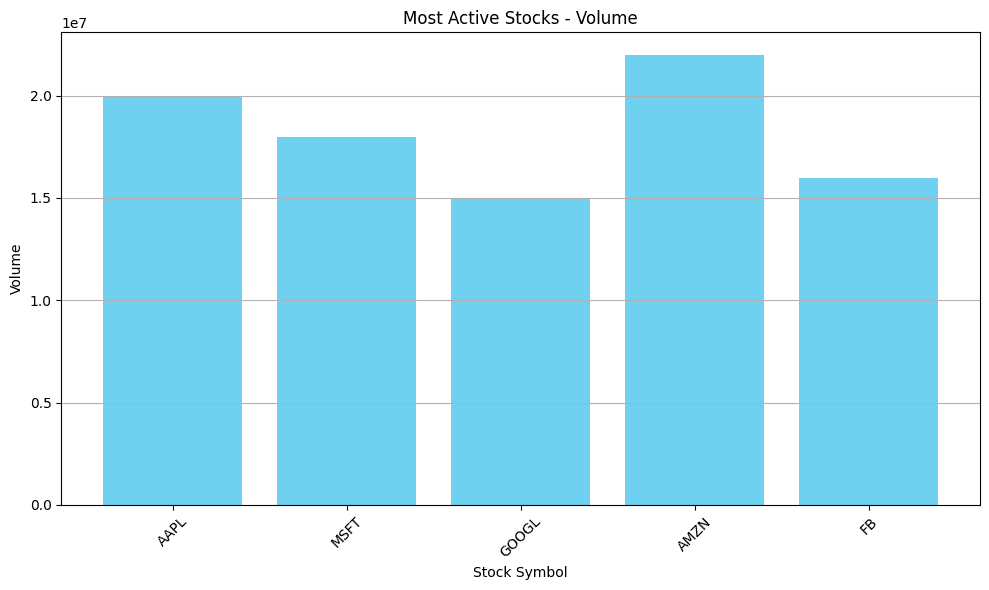
5. Creating a bar chart
Now, I'll create a bar chart to visualize the volume of the most active stocks.
# Assuming the DataFrame 'yahoo' is already defined

# Create the bar chart
plt.figure(figsize=(10, 6))
plt.bar(yahoo['Symbol'], yahoo['Volume'], color='skyblue')
plt.title('Most Active Stocks - Volume')
plt.xlabel('Stock Symbol')
plt.ylabel('Volume')
plt.xticks(rotation=45)
plt.grid(axis='y')
plt.tight_layout()
plt.show()
- I reused the DataFrame 'yahoo' created in the previous section and created a bar chart using
plt.bar(). The x-axis represents the stock symbols, and the y-axis represents the volume of each stock. - I then customized the chart title, x-label, y-label, and other properties for better visualization and again used
plt.show()to display the plot.
Here's the complete code:
import pandas as pd
import matplotlib.pyplot as plt

# Assuming you already have yahoo DataFrame loaded
# yahoo = pd.read_html("https://finance.yahoo.com/most-active/")

data = {
    'Symbol': ['AAPL', 'MSFT', 'GOOGL', 'AMZN', 'FB'],
    'Volume': [20000000, 18000000, 15000000, 22000000, 16000000]
}
yahoo = pd.DataFrame(data)

# Create the bar chart
plt.figure(figsize=(10, 6))
plt.bar(yahoo['Symbol'], yahoo['Volume'], color='skyblue')
plt.title('Most Active Stocks - Volume')
plt.xlabel('Stock Symbol')
plt.ylabel('Volume')
plt.xticks(rotation=45)
plt.grid(axis='y')
plt.tight_layout()
plt.show()
And here's the output:
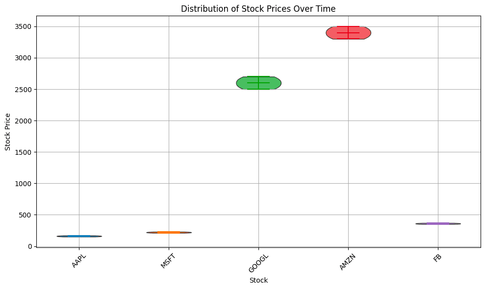
6. Creating a violin plot
Finally, I'll create a violin plot to visualize the volume distribution among the most active stocks.
# Preparing data for the violin plot
data_long = yahoo.melt(id_vars='Date', var_name='Stock', value_name='Price')

# Creating the violin plot using Matplotlib
fig, ax = plt.subplots(figsize=(10, 6))
stock_labels = data_long['Stock'].unique()

# Create a violin plot for each stock
for i, stock in enumerate(stock_labels):
    stock_data = data_long[data_long['Stock'] == stock]
    parts = ax.violinplot(stock_data['Price'], positions=[i], showmeans=False, showmedians=True)
    for pc in parts['bodies']:
        pc.set_facecolor(plt.cm.tab10(i))
        pc.set_edgecolor('black')
        pc.set_alpha(0.7)

# Customizing the plot
ax.set_xticks(range(len(stock_labels)))
ax.set_xticklabels(stock_labels)
ax.set_xlabel('Stock')
ax.set_ylabel('Stock Price')
ax.set_title('Distribution of Stock Prices Over Time')
plt.xticks(rotation=45)
plt.grid(True)
plt.tight_layout()

plt.show()
- Here, I created a violin plot using
ax.violinplot()for each stock. The x-axis represents the different stocks, and the y-axis represents the stock prices. - I converted the DataFrame to long format to suit the requirements of the Matplotlib violin plot function.
- I customized the chart title, x-label, y-label, and other properties to improve clarity and again used
plt.show()to display the plot.
Here's the final code:
import pandas as pd
import matplotlib.pyplot as plt

# Sample data with time and stock prices
data = {
    'Date': pd.date_range(start='2020-01-01', periods=5, freq='Y'),
    'AAPL': [150, 155, 160, 165, 170],
    'MSFT': [210, 215, 220, 225, 230],
    'GOOGL': [2500, 2550, 2600, 2650, 2700],
    'AMZN': [3300, 3350, 3400, 3450, 3500],
    'FB': [350, 355, 360, 365, 370]
}
yahoo = pd.DataFrame(data)

# Preparing data for the violin plot
data_long = yahoo.melt(id_vars='Date', var_name='Stock', value_name='Price')

# Creating the violin plot using Matplotlib
fig, ax = plt.subplots(figsize=(10, 6))
stock_labels = data_long['Stock'].unique()

# Create a violin plot for each stock
for i, stock in enumerate(stock_labels):
    stock_data = data_long[data_long['Stock'] == stock]
    parts = ax.violinplot(stock_data['Price'], positions=[i], showmeans=False, showmedians=True)
    for pc in parts['bodies']:
        pc.set_facecolor(plt.cm.tab10(i))
        pc.set_edgecolor('black')
        pc.set_alpha(0.7)

# Customizing the plot
ax.set_xticks(range(len(stock_labels)))
ax.set_xticklabels(stock_labels)
ax.set_xlabel('Stock')
ax.set_ylabel('Stock Price')
ax.set_title('Distribution of Stock Prices Over Time')
plt.xticks(rotation=45)
plt.grid(True)
plt.tight_layout()

plt.show()
And here's the output:
Conclusion and next steps
Now you know how to use Python with Matplotlib and Pandas to create three types of data visualization - scatter plots, bar charts, and violin plots - to analyze and communicate data insights in a clear and impactful way.
If you're interested in learning how to gather web data for visualization, check out our Python web scraping tutorial. Additionally, if you'd like to understand the basics of web data extraction and its applications, take a look at our article, What is web scraping? for a comprehensive overview.
If you don't want to build your own scrapers from scratch, there are well over a thousand ready-made data collection tools you can try for free on Apify Store. Check it out.