Apify is turning 10 soon, and with this milestone approaching, we've given our brand a thoughtful refresh that reflects how much we've grown over the past decade.
Apify started as two founders with big dreams about making the web more programmable, working out of a small house in Mountain View, California. Today we're a company of 150 people serving more than 10,000 customers across 100+ countries. That kind of growth calls for visual evolution.
Our original brand served us well, but it was time for our visual identity to catch up with who we've become. This isn't a total overhaul, but rather a new chapter that pays tribute to our roots while preparing us for what comes next.
Why now?
As Apify has become the most complete ecosystem where developers build, deploy, and publish web scrapers, AI agents, and automation tools, our visual identity wasn't reflecting the full scope of what Apify offers today. We needed a brand system that could scale with our expanding product suite and growing global community.
We also had some technical design limitations that were holding us back. We didn't have a clear system for creating visual assets, which meant things could start to look inconsistent as our team and product suite grew. We'd reached a point where we needed to update our design system to create a flexible foundation that could support everything from Apify Console to conference booth graphics.
So we've refined our brand positioning to better highlight what makes Apify special: we're technical enough for developers who need powerful automation capabilities, but approachable enough for users who want to get things done without getting lost in complexity. This balance became our North Star for the entire visual refresh, guiding every design decision from typography choices to color palettes.
The grid: Apify’s new design system
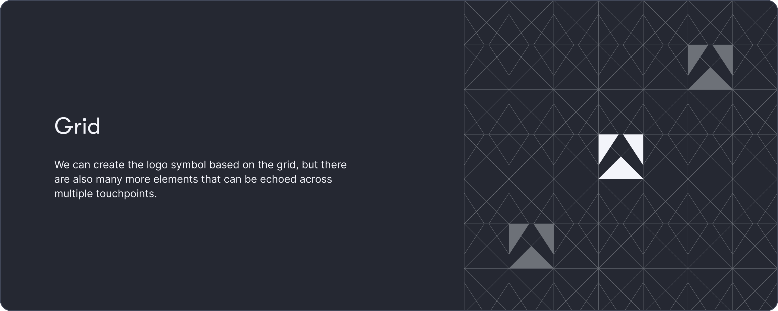
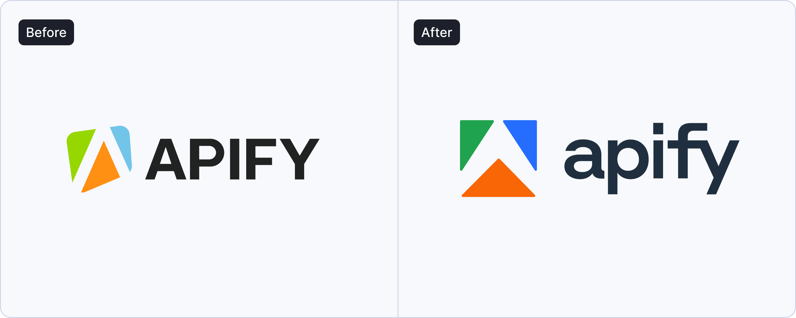
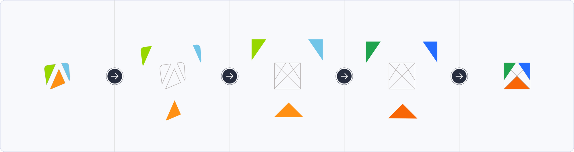
Our biggest challenge was evolving the Apify symbol while maintaining visual continuity. We loved the triangular elements and the negative space that formed an uppercase A, but we needed something more systematic.
The solution is the grid. By organizing our triangular DNA into a structured system, we created something that's both familiar and fresh - giving us clear rules for creativity while maintaining the flexibility to create diverse assets.
We think of the Apify grid like the grid in Tron - a digital foundation where anything is possible, much like the Apify platform itself. This philosophy is already reflected in our Crawlee page, where we use vibrant colors, grid systems, and primitive shapes to illustrate complex concepts.
Vibrant colors for a digital brand
We wanted colors that felt alive on screen, in print, and in life. So we updated and expanded our color palette to be more energetic, moving away from the muted tones that dominated our previous branding.
These new colors are both more vivid and more functional for our design system. The expanded palette gives us more ways to organize information clearly and create better visual distinctions across the platform.
Finding the perfect typographic tone
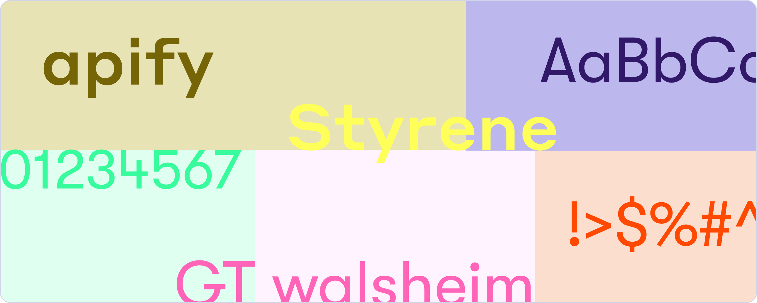
The right typography was key to our "technical yet approachable" positioning. We realized we needed fonts that could do something pretty unusual - make complex automation concepts feel approachable without watering them down. How do you visually say "this is sophisticated technology ready for Fortune 500 companies, but you can master it"?
The solution went beyond just picking new fonts. We wanted our entire visual language to achieve this balance. That's why we use primitive shapes in our illustrations. They show how Apify lets you create complex workflows starting with simple, fundamental building blocks.
One of the most visible changes is our shift to lowercase in the Apify wordmark. By tweaking an existing typeface rather than creating something entirely new, we've achieved a unique look that feels distinctly Apify without being unnecessarily complex or trendy.
Evolution, not revolution
Throughout this process, we kept returning to a simple principle that comes directly from our founder and CEO, Jan Curn: “This brand refresh should be evolution, not a revolution.”
We didn’t want to reinvent Apify, but rather help people see the company and our future more clearly.
The refresh maintains everything that made our original brand recognizable, while addressing the limitations that held us back. Existing users will still recognize us, but new audiences will get a better sense of what we're all about.
What's next?
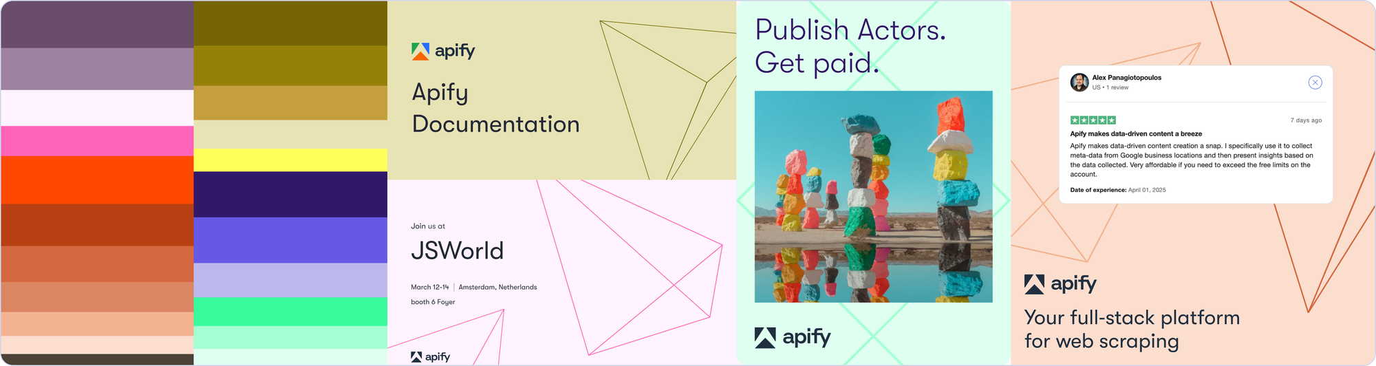
This brand refresh is just the beginning. Over the coming months, you'll see these changes roll out across Apify Console, documentation, and everything in between.
More importantly, this evolution reflects our commitment to everyone building web scrapers, AI agents, and automation tools on the Apify platform. The new brand better represents the solutions you create every day.
We're excited to show you how this unfolds, and we think you're going to love what we build together.